Cannabis Product Photography with Dutchie: A Creative Case Study
Overview
A few years ago, I had the opportunity to collaborate with Dutchie, alongside the talented team at The 9th Block, on a high-end product photography campaign for Dutchie's newly launched cannabis line.
The goal? To produce a suite of premium cannabis product imagery that could elevate the brand across its website, digital ads, and marketing materials. The creative direction needed to be clean, intentional, and deeply connected to Dutchie’s identity—with visuals that stood out in a competitive and often oversaturated space.


Concept Development: Building a Visual Identity
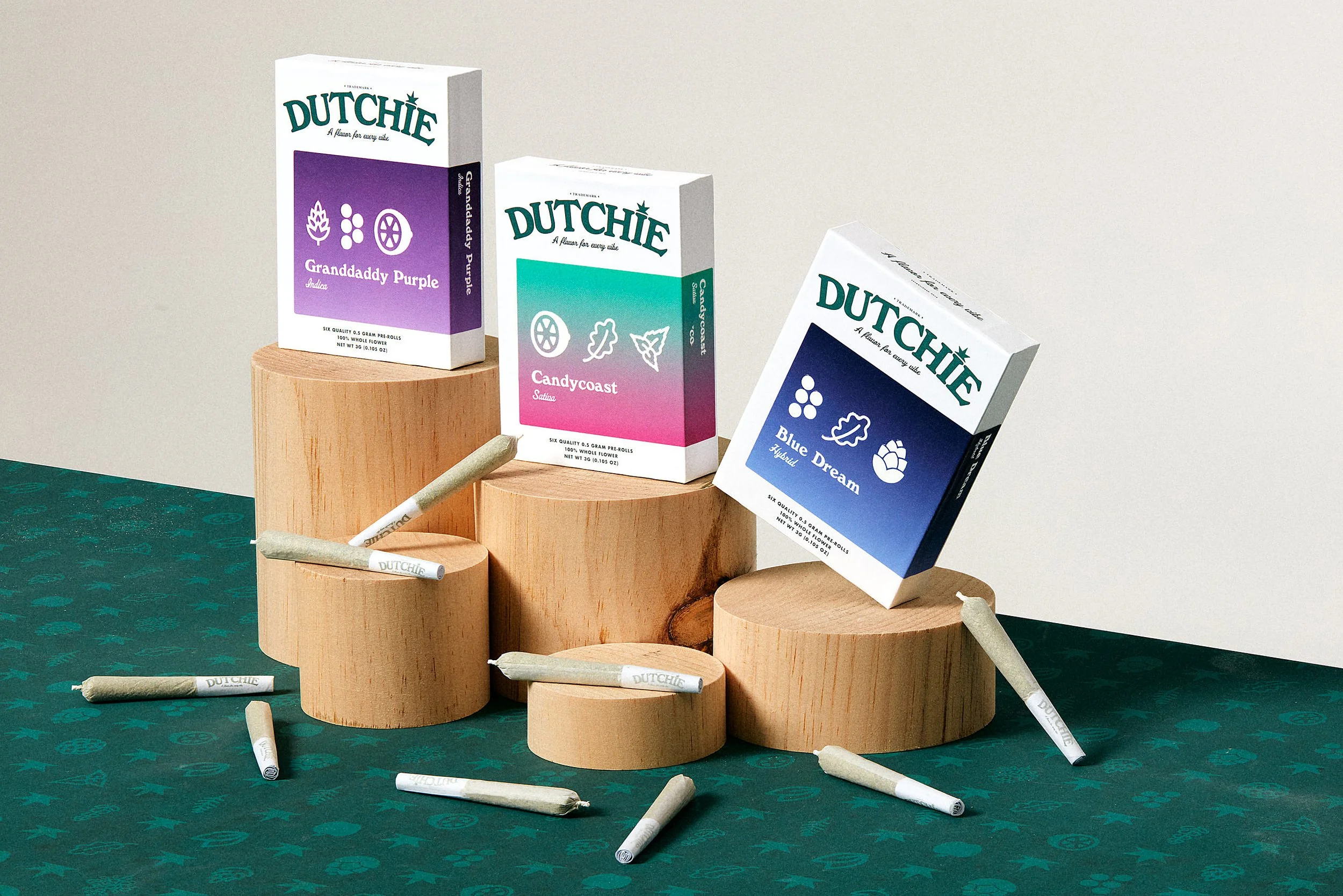
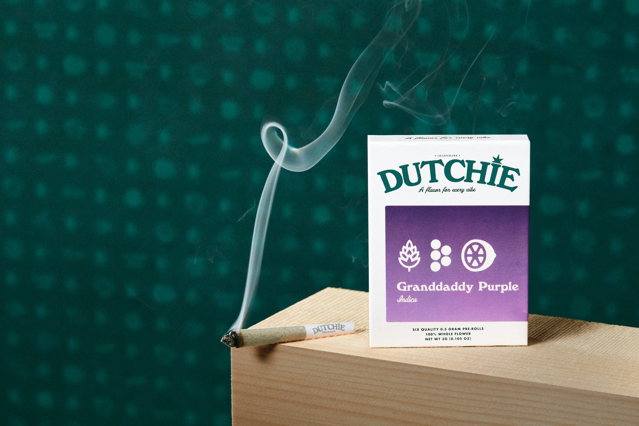
At the heart of Dutchie’s branding was a distinctive pattern—used across their packaging and other marketing collateral. I saw this as a natural visual anchor for the shoot. Rather than digitally impose it in post-production (as some might suggest), I took a more tactile route. I had the pattern printed at 40”x60” scale to physically place into the scene.
Why go analog in a digital world? Because:
Perspective and scale were instantly accurate—no tedious Photoshop warping needed.
Color consistency matched the real packaging without risking monitor-to-print discrepancies.
Natural shadows and highlights added realism and depth that digital overlays often lack.
The authentic depth of field created in-camera offered a richness that post-work struggles to replicate.
To further shape the environment, I introduced hand-crafted blocks made of roughsawn pine. These elevated the composition—literally and visually—adding layers, height, and warmth to the overall aesthetic. The subtle grain of the wood contrasted beautifully with the clean lines and color of the packaging.


Storytelling Through Ingredients
A unique aspect of Dutchie’s product line was its focus on terpene categorization. Terpenes are the aromatic compounds that give cannabis its distinctive scent—and Dutchie aimed to make them front and center for consumers. Each strain was grouped by dominant terpene, such as limonene, linalool, pinene, and caryophyllene.
To help bring this idea to life visually, we introduced real-world ingredients associated with those terpenes into the set:
Citrus fruits for limonene
Lavender sprigs for linalool
Pine needles for pinene
Whole peppercorns for caryophyllene
These elements added context, texture, and a subtle sensory story—without overwhelming the product itself. Everything stayed clean, balanced, and purpose-driven. This layered storytelling is where product photography becomes brand narrative.
The Results
The final suite of images provided Dutchie with:
A strong visual language for digital and print marketing
Cohesive, on-brand imagery for e-commerce and social platforms
A library of assets that communicated both quality and purpose
More than just photography, this campaign helped visualize a young brand’s identity in a mature, thoughtful way—without gimmicks or clichés.
Strong cannabis product photography requires more than just good lighting. It demands an understanding of branding, storytelling, and the nuanced aesthetic that appeals to both seasoned and curious consumers.
This campaign with Dutchie was a perfect example of what happens when strategy, craft, and creativity all align.
Let’s Collaborate
If you’re interested in creating a bespoke product photography campaign for your brand, or have questions about this project, I’d love to chat.
📩 Shoot me a message to discuss your vision!
Thanks for looking,
Campbell Bishop